The long-awaited information panels have arrived on the Downs. These have been nearly two years in the making, with the world at large getting a peek in the last couple of months. Here are the "before and after consultation" versions of the panels and below them, for what it's worth, is what I sent the nice people at CCC.
Click any of the pictures to see a bigger version.
 click it to big it
 click it to big it
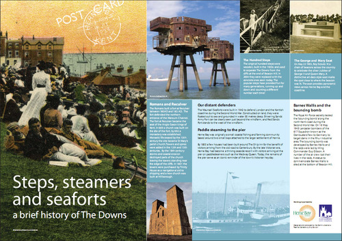 click it to big it
 click it to big it
 click it to big it
 click it to big it
Here's some thoughts on the panels:
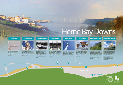
Orientation
- Do not have just one copy of this on The Downs. There should be copies at 1, 3, 4 and 8 - even if only A4 or A3 in the existing noticeboards, to encourage people to come and have a look.
- I understand what you're trying to do with the background photo, but it could be confusing for visitors.
- On the map at the bottom, the colours seem to have been reversed: it should be green for The Downs, and grey (or residential splodges) to show where the housing is. At the moment, Herne Bay appears to consist of green fields running up to a concrete strip next to the sea!
- The map should show the main paths on The Downs and the Promenade, so that people know they can actually get to all the places shown.
- If the numbered dots on the map aren't going to be arranged to scale (putting Reculver off the right of the map!), they should be in the correct relative positions, i.e. Bishopstone Glen to the right of You Are Here.
- An indication of the distance, especially to Bishopstone and Reculver, would be helpful.
- PLEASE increase the size of the text.
- Space can be reclaimed from the top and bottom of the panel, allowing more height for the 8 text boxes, and the boxes can run wider across the panel. This would allow for the all-important text to be readably large - as it is, it's simply too small, given the space available.
- (Box 1) I'm sure you can find a better picture of the Pier.
- (Box 2) The clocktower is 75 feet (23m) TALL. Free-standing is usually hyphenated.
- (Box 3) In the heading: Neptunes Arm. In the text Neptune's arm. Correctly, both should be: Neptune's Arm.
- (Box 4) King's Hall has an apostrophe.
- (Box 7) There's no need to repeat "Bishopstone Glen" in the text.
- (Box 8) There's no need to repeat "Reculver Towers" in the text.
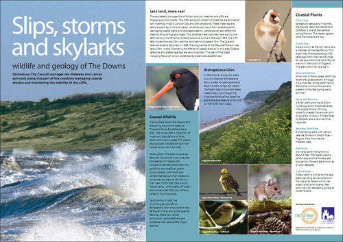
Wildlife
- The Downs are seething with nature, and it's hard to know which bits to choose. Personally, I would swap the Chiff-Chaff for a Kestrel - people are more likely to notice a kestrel and wonder what they're looking at.
- I would like to see the Slow-worm get a look-in - it's an endangered species, we're lucky to have it, and we should be proud of it.
- Coastal wildlife section: 2nd paragraph "habitats. chiff-chaff" should be "habitats. Chiff-chaff" and in the next sentence chiff-chaff should be hyphenated.
- Bishopstone Glen: don't just repeat what's appeared on the Orientation Panel - say something additional and wildlife-y about it, like its distinctive insect life.
- Bishopstone Glen: rather than a picture that doesn't even show the Glen, have a picture looking up (or down) the glen, so people can see what an odd and interesting place it is: attached.
- The description of the Miramar landslip is confusing.
- Pictures, or at least line drawings, of the plants mentioned would be much more useful than the very brief descriptions.
- About one-third of this panel is wasted on pictures of what people can already easily see, just by glancing away from the panel - use it instead for wildlife identification pictures and/or wildlife info.
Heritage
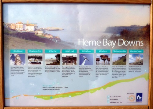
- I like this - it gives a feel for the range of history in Herne Bay. Easily the best of the three panels.
- I think the Hundred Steps, George & Mary Seat, and the Barnes Wallis statue should be marked on the Orientation Panel.
- The Bouncing Bomb section should mention that it was tested just along the coast at Reculver - otherwise it looks like the statue is our only link to the Dambusters.
- There MUST be a clear message directing people to the Herne Bay Museum (for example in the white space under the bouncing bomb paragraph). I've had an email from Margaret Burns saying that she cannot see any objection to including a reference to the Museum.


;)
 CCC,
CCC, 
;) click it to big it
click it to big it;) click it to big it
click it to big it;) click it to big it
click it to big it;) click it to big it
click it to big it;) click it to big it
click it to big it;) click it to big it
click it to big it